
Analyzing the Cohorts of an Online Retail Store
using SQL, Python and Tableau.

Table of contents

No headings in the article.
I guess it's late already to say “Happy New year,” but in case you are still comfortable hearing it, I want to say a very big " Happy New Year filled with massive opportunities and growth."
I am certain you have documented your activities for 2022 and you're making everything possible to do better this year. What are you appreciative of in 2022 as a business executive, founder, or co-founder?
It’s that time of the year when you should evaluate your business activities. Therefore, do you have any concerns regarding altering marketing budgets, enhancing customer experience, or raising the retention rate? As a business owner, you understand the feeling that comes with seeing an increase in customers, subscriptions, sales, and even revenue. You may be tempted to keep expanding your marketing or advertising campaigns without conducting the necessary analysis to determine your customers’ lifetime value and retention rate.
Cohort analysis can be used to overcome these issues. It assesses the features of particular consumer groups in comparison to overall impressions and sales figures. When deciding whether to invest in your company, a “Venture capitalist” may request information such as cohort analysis to aid his decision. He wants to know:
If you can keep your subscribers or customers? at what rate? (Customer Retention)
What percentage of clients did you lose each month? (Churn Rate)
your customer’s Lifetime value.
Thumbs up if your company has an analytical/Business Intelligent staff that is capable of performing this analysis. Grab a bottle of zobo (hibiscus tea), keep reading, and get ready for implementation if your company lacks an analytical/BI team but would love to perform this analysis.
The thing is that your data only provides broad numbers like the overall number of people who viewed particular pages or bought things from your store and the locations where users were losing interest. It doesn’t provide the identities of the users who are leaving, how they got there, or how it stacks up against other user types. It doesn’t make clear where the actual issue is. By using cohort analysis, you may segment consumers into different groups as opposed to viewing them as a single, amorphous mass. Then you observe trends that set one cohort apart from another by measuring how those cohorts behave.
This analysis can be used for retail stores and also for SaaS businesses with monthly subscriptions. A cohort in this context is a collection of individuals with similar characteristics. Cohorts of users can be divided in any way you see suitable, provided that each group has a characteristic in common and can be compared to the others.
I think you now know what a cohort is and what a cohort analysis is.
We shall adhere to the following plan for this project:
Data collection
Data cleaning by Handling missing values
Data processing
Data visualization
Data interpretation and insights
let’s go 😄
Data Collection:
The dataset is Online Retail Dataset by Dr Daqing Chen, Director: Public Analytics group. chend ‘@’ lsbu.ac.uk, School of Engineering, London South Bank University, London SE1 0AA, UK. which can be accessed here.
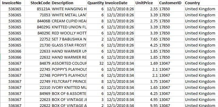
It has 8 columns and 541,909 rows which I downloaded in Excel format.
Data Cleaning:
The dataset needed cleaning as the following was observed:
Some rows are without “CustomerID”,
Some rows were duplicated
The Columns “UnitPrice” and “Quantity” had rows with numbers lesser than zero (negative numbers) and they can’t be beneficial to our work.
Hence all the duplicates, empty rows and irrelevant data were removed using the filter function in Excel to search for those empty rows. Also using the remove duplicates function. A clean Dataset of 320,900 rows and 8 columns.
Data processing:
This work required the use of Python and SQL. In order to prevent anyone from being discouraged when trying this project, I employed a variety of tools and tactics, based on my particular interests and skill sets.
The already-cleaned data was the dataset that was entered into Python and SQL.
We will examine the data to create an “invoice month” using the Python code below, setting the start date of each invoice month to the first day of the month.
#Let's create an invoice month, making all days to start form the first day of the month. import datetime as dt
#defining the function for month
def get_month(x):
    return dt.datetime(x.year, x.month,1)#apply the function to the dataframe
df['InvoiceMonth'] = df['InvoiceDate'].apply(get_month)
df.tail()
Then, using the InvoiceDate’s minimum value for each client, we will build a column called “Cohort Month”. This will allow us to determine the customer’s cohort and the first time they purchased items.
#Lets create a column named Cohort Month with the minimum invoice date to know the first time customer was acquired df['Cohort Month'] = df.groupby('CustomerID')['InvoiceMonth'].transform('min') df.tail(20)
To determine their loyalty and whether they are repeat customers, we will then need to determine the month gap between the InvoiceDate and the initial date of purchase. The “CohortIndex” will be the name of this column.
#create a cohort index year_diff = Invoice_year - Cohort_year month_diff = Invoice_month - Cohort_month df['CohortIndex'] = year_diff*12+month_diff+1 df.tail()
Are you getting confused? You must not. I’ll provide you access to the project’s whole source code so you can fully comprehend it.
Data Visualization:
Next, we will utilize “CohortMonth” and “CohortIndex” to create a groupby object. Use the pandas nunique() function to get the number of customers in each group and lastly reset the index and make a pivot in pandas with the fields CohortMonth, CohortIndex, and CustomerID counts as values.
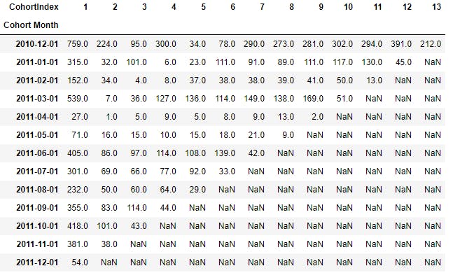
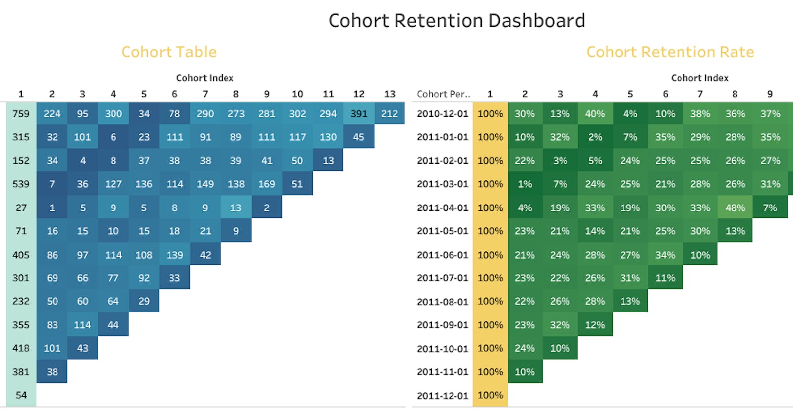
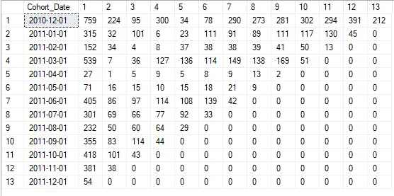
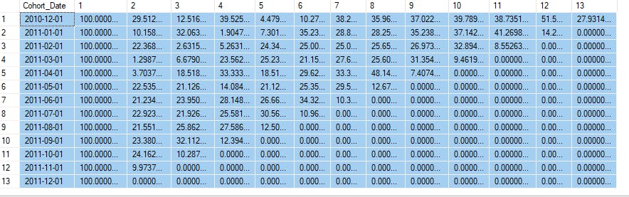
The Cohort table that has been created will be used to calculate Retention Rate and other matrices.
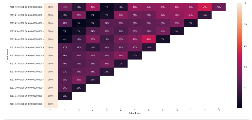
What is Retention Rate? It shows how many clients from each cohort have returned in the following months.
Using the dataframe called “cohort_data” we will select the First columns (equal to the total number of customers in cohorts)
Calculate the ratio of how many of these customers came back in the subsequent months.
and the result will be a retention rate that will be visualized using “heatmaps” as Heatmaps are the most efficient way to view and examine cohort analysis data. It offers both the actual metric values and the color coding to allow users to quickly identify numerical discrepancies. The python codes can be found in this repository.
Using SQL:
The concept and pattern are also the same as the python programming method. The difference is in the way the different languages structure their syntaxes. Find the full SQL script here: Visualization was also done in SQL to get the tables below:
Data Visualization:
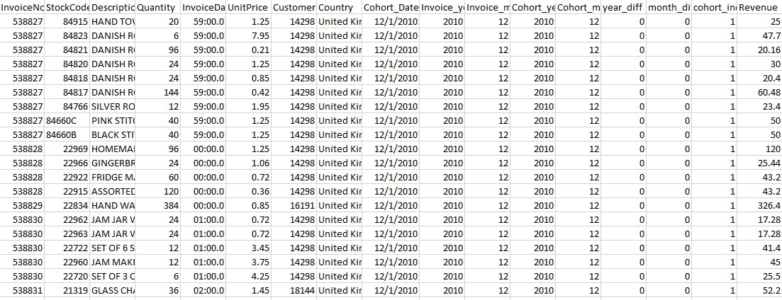
I felt that using Tableau to make the visualization was essential. The dataset was saved from SQL after all the processing was complete.
Furthermore, I created a new column called Revenue by multiplying the quantity by the unit price. The new dataset looks like the picture below and it was uploaded into Tableau
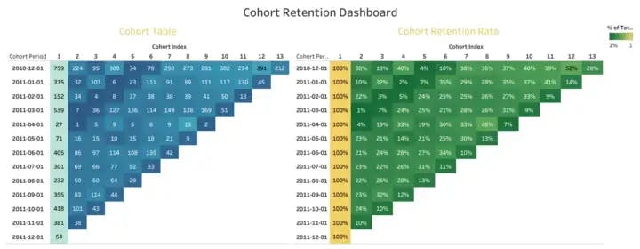
The following Visuals are created in Tableau with some calculated fields.
I created a calculated column named “ Number of Records” which is a distinct count of CustomerID. The formula is “COUNTD(CustomerID)”
I changed Cohort Index to dimension and duplicated the cohort date to get another column named “Cohort period”, which is in string format.
The cohort period is dragged to the rows, cohort index is dragged to columns and the “number of records” is dragged to text.
Below are the visualizations that were created. The interactive dashboard on Tableau can be found here.

Data interpretation and insights:
There are 13 cohorts in this. A cohort for each month’s batch. The lighter the color shade, the higher the values. This suggests that 52% of cohorts that purchased in December 2010 were still active 12 months later if we look at the 2010–12 cohort Month in the 12th Cohort Index. Alternatively, we can state that the business was successful in keeping 52% of customers who had previously purchased its items.
The first cohort: As can be seen in the graphic, there is a steep decline in sales starting in the second month (indexed as 2), when, on average, 70% of customers fail to make any purchases.
90% of clients in the second cohort don’t make any purchases in the second month.
78% of clients in the third cohort do not make any purchases in the second month.It’s bad that 99% of customers in the fourth cohort don’t make any purchases in the second month!
96% of clients for the 5th Cohort don’t make any purchases in the second month.
77% of clients for the 6th Cohort don’t make any purchases in the second month.
79% of customers in the 7th Cohort don’t make any purchases in the second month.As observed in the eighth, ninth, tenth, eleventh, and twelveth cohorts, 77%, 78%, 77%, 76%, and 90% of buyers fail to make any purchases in the second month.
When compared to the previous cohorts, the first one (2010–12) appears to be different and performs fairly well. 52% of customers are still with them a year after the first purchase. This may be a group of devoted users that first signed up for the platform because of prior relationships they had with the retailer. That, however, is exceedingly challenging to precisely explain based on the dataset alone.
Again, The fifth cohort (2011–04) experienced growth, and by the eighth month, the business had seen a rise and 42% retention rate.
We can observe variations in retention over time across the entire matrix. The nature of the business, where customers make recurring transactions followed by periods of inactivity, may be the root cause of this.
Every month, there was a decline in both the number of customers and the amount of money made.
Once you've understood the happenings in the cohorts, you can then restrategize and plan for your marketing, customer experience and satisfaction and also product quality. This will impact positively going forward.
The analysis of the cohort for the retention rate is complete. Cohort analysis can also be done for other business matrices, such as Customer Life Time Value.
Limitations:
I wanted to determine the customer’s lifetime value, but I lacked the necessary data. Keep in mind that the dataset was obtained and that there was no way to contact the company (stores) to obtain extra information that would have improved the analysis.
Wow, you followed till this point? You are a STAR! You are AWE-MAZING! Yes, you.
I am certain that you learnt a thing or two?
I will love to hear from you.
Do you want to try this analysis? Try it and don’t forget to tag me.
You will find the codes for this project in this repository.
I would like to appreciate Angelina Frimpong, I found her content on YouTube that helped my learning.
I am open to any collaboration concerning data analysis, data storytelling and also opportunities to share my tech journey with anyone.

This is me, wishing you a Happy New Year. It is time for exploits!
Till I come your way again…
Cheers!